
The beauty of colours
Everybody knows the regular set of colours - red, blue, green. We use them in our everyday lives while crossing the road, reading journals, or dealing with the noisy red colour of deadlines. Most of the time we see a great number of hues, but rarely do we think of the interesting stories that some of these colours hold.
The masters of the previous centuries had a different relationship with colours because they could not just buy a set of paints and start working on their masterpieces straight away. Instead, they had to purchase colourants and dyes at unique shops, such as alchemists or pharmacists. Then they had to grind minerals and herbs into powder, a process that could take a long time and could even deal with toxic ingredients. All these efforts were aimed at getting the perfect hues, which sometimes have beautiful stories behind them. One must keep in mind how we take colours for granted in this day and age, where once there was quite a mastery behind them.
Dangerous white
 Woman writing a letter, with her maid, Johannes Vermeer, c. 1670-1671
White is a colour of purity and is often associated with positive meanings. For example, the white dove symbolises peace, the white flag is a symbol of truce, and the saviour is usually a knight on a white horse. Nevertheless, almost every colour has a dual meaning and white can also be a colour of death in some cultures.
Lead white is an opaque white pigment that has been used since ancient times. It is one of the oldest synthetically produced pigments that was common in many cultures. It also was the most popular white pigment in European painting in the 16th and 17th centuries. Artists loved lead white for its density and opacity as well as for its ability to attach to almost every surface. But it was used not only in art and almost until the 20th century this pigment was used to colour ceramic tableware and plumbing.
But there was one disadvantage of lead white. By composition, this pigment is the basic lead carbonate with a crystalline molecular structure and is deadly dangerous for the human body. Nevertheless, up to the 19th century, women used lead white as a cosmetic product for whitening their skin. Nowadays the use of lead white is restricted in the majority of countries.
Rosso Corsa
 and journalist Luigi Barzini (right) in the Peking to Paris race. Art De Vivre") Scipione Borghese (left) and journalist Luigi Barzini (right) in the Peking to Paris race
Scipione Borghese (left) and journalist Luigi Barzini (right) in the Peking to Paris raceAccording to the French historian Michel Pastoureau (b. 1947), red is associated with fire, it is the colour of life and blood as the source of life. In culture, it is mostly associated with power, lust and anger. Scientists say that red colour can influence human physicality and psychology. It can speed up the heartbeat and raise blood pressure. Red is also a colour that promotes readiness for action and self-confidence, and in large quantities causes anger and rage.
The majority of Italian race cars are coloured in a special red hue. Its story begins in 1907 when the French newspaper ‘Le Matin’ published a note for all the courageous racers. The challenge was to race a car from Peking to Paris. One of the adventurous racers was Italian aristocrat Scipione Borghese (1871-1927) who already was known as a traveller, explorer and mountain climber.
Borghese, who just returned home after the trip to Persia, rushed to the hype of his new race trip in a powerful Italian car coloured bright red. The distance was about 12 thousand miles from the Great Wall of China through the Gobi desert and Ural Mountains. The legend says that Borghese was so confident in his abilities that he decided to make a little stop in St. Petersburg to have a rest attending the ball. Nevertheless, Borghese won this race and due to this win the red colour of his car became the official colour of the racing cars of Italia.
Decadence yellow
 The Yellow Book with a cover illustrated by Ethel Reed
In the 19th century, French books with yellow covers were mostly dime novels that were condemned by such writers as Edgar Allan Poe (1809-1849). Nevertheless, such literature was quite popular and books in yellow covers flooded shops near the train stations. This colour is still sometimes associated with yellow journalism. But it was not just a colour of such literature but also one of the symbols of modernism, its aesthetic and decadent movement.
The artists of the late 19th century associated this colour with the rejection of the Victorian values that bounded the freedom of creativity. In the 1890s English writer Richard Le Gallienne (1866-1947) wrote an essay in defence of this colour. The last decade of the 19th century was called the ‘Yellow Nineties’ due to the English literary periodical ‘The Yellow Book' which became the brightest manifestation of decadent culture in England and brought together many figures of aestheticism in the 1890s.
Yellow books appeared in some of the paintings of Vincent van Gogh (1853-1890) in the 1880s. For them and for his famous still lifes with sunflowers the artist used a pigment called yellow chrome. Van Gogh was one of the first artists who became fond of this bright hue. Unfortunately, there was one disadvantage of yellow chrome that was hidden from van Gogh but is shown for contemporary art lovers, it tends to darken with time acquiring a brown hue.
Poisonous green
 Monsieur Boileau at the Café, Henri de Toulouse-Lautrec, 1893
Green is a colour that is mostly associated with calmness, youth, and nature. But once there were problems with its production. There was a long-standing ban on the production of green colour by mixing blue and yellow. All the existing pigments were not as bright as it was needed for the artists. Artists had trouble with this colour even in the 19th century, and such problems were probably the reasons that green is often associated with poison, envy and even evil.
Such a reputation was also supported in the 19th century when Europe discovered the absinthe also called ‘la fée verte’ or ‘the green fairy’. This alcoholic drink is made of a mixture of ground verbs such as wormwood, green anise, sweet fennel and others. As a result, it turns out to be a green or transparent drink. Initially, it was made for medical purposes, but eventually, it was used as an aperitif – an alcoholic drink to consume before dinner to whet the appetite.
By the 1860s absinthe became incredibly popular and was associated with loose bohemia and decadence, artists and writers such as Oscar Wilde (1854-1900) or Paul Gauguin (1848-1903). Later companies started producing it from cheaper alcohol and this drink became popular among all the classes. In the late 19th century some of the districts of Paris from 5 to 6 o’clock smelled like herbs and spices. This time was called ‘l’heure verte’ or ‘the green hour’. The popularity of this drink and the amount consumed was the source of concern as it was thought to be an intoxicating narcotic drink and shortly before World War I was forbidden.
Van Dyck brown
 Samson and Delilah, Sir Anthony van Dyck, 1618-1620
Brown was the first pigment to be used by humans for depictions of bulls and animals on the walls of caves. Ancient Greeks and Romans made a reddish-brown ink made from the ink of various cuttlefish. It was used for sketches by Leonardo da Vinci, Raphael and other artists during the Renaissance. Nevertheless, it is actually not a colour, but a hue and there were no bright hues of brown. This was probably the reason why brown was neglected by artists for many centuries.
During the Renaissance brown was rediscovered and became one of the main colours for art. In the 17th and 18th centuries, the brown colour became very popular among artists, thanks to such artists as Caravaggio (1571-1610) and Rembrandt (1606-1669). They used brown colours to create chiaroscuro effects - when the subject appears as if from darkness. Rembrandt also began using a new earthy brown pigment. It was the natural colour of the earth, soil and peat. This warm dark brown hue is called ‘terre de Cassel’ and was often used in printmaking. Flemish baroque artist Anthony van Dyck (1599-1641) was so masterful in working with this hue that later it was called ‘the van Dyck’s brown’.
Expensive blue
 The Virgin in Prayer, Giovanni Battista Salvi da Sassoferrato, between 1640 and 1650
Western cultures in their early stages underestimated the blue colour. Ancient Romans associated blue with barbaric cultures and this colour also symbolised mourning or was thought to be attracting neatness. Only in the 12th century by virtue of Abbot Sugerius, this colour was rethought and got new values. He believed that all of the colours – especially the blue one – were divine. He was also curating the reconstruction of the Cathedral in Saint-Denis. At that time glaziers discovered the cobalt glass painting technology that allowed them to create a deep beautiful blue colour for stained glass windows.
At this time blue also became associated with Mother of God who was often depicted in bright blue clothing. Her clothing was mostly depicted with a blue hue called ultramarine blue that was produced from a semi-precious stone called lapis lazuli. Many old masters such as Titian, Vermeer, Botticelli used this pigment. It had a deep beautiful colour and was extraordinarily stable and durable. But lapis lazuli was very expensive and therefore artists used it not as often as they wanted. Sometimes the price of this hue was added separately to the price of the painting as an additional expense.
No wonder that in 1960 French artist Yves Klein (1928-1962) patented the international blue colour formula and called it ‘International Klein Blue’. This colour has always had a special meaning for Yves Klein. He believed that all other colours give rise to specific associations, while blue conjures up the most abstract thing that exists in nature - the sky and the sea. In addition to the blue colour observed in nature, Klein had another source of inspiration - Giotto's frescoes in the Scrovegni Chapel where the artist used the ultramarine blue.
The sets of paints we see now only appeared in the 19th century. By this time many colours were produced synthetically, just like now. But still, all of these colours carry the stories of their creation and usage in previous ages. Colours are incredibly powerful and it’s beautiful to take a moment to appreciate where they came from.
Are you looking for a summer read? Check out our editor’s picks for our most inspirational books for this summer.
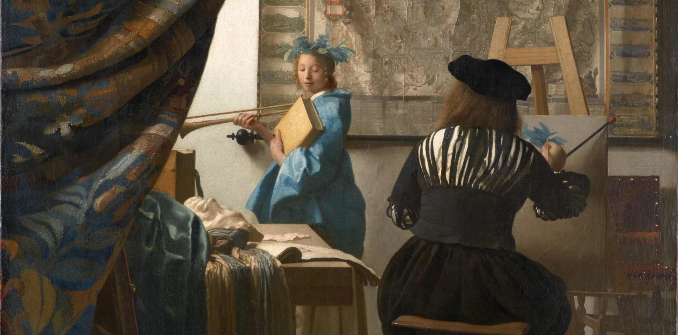
Credits for the Main photo: The Allegory of Painting (detail), Johannes Vermeer, c. 1666-1668. - Wikimedia Commons
Photo Credits: Wikimedia Commons